On another note, I was featured again. YAY! Yipee! Woo to the Hoo! Yee-Haw! Shannon & Dean have an amazing blog, AKA Designs, where they feature thrifty decor finds, home decor tips, DIY tutorials and much more. They have amazing style, so of course, I was honored and giddy when they featured my apron holder on their site. Be sure to click the link below and check out this amazing couple and their work, along with my feature.
For today's project that I'm sharing, first I'll apologize for not getting good before pictures, and secondly, I'll give you a background story. Client "A" had this piece below:
It was a plastic piece with a factory finish. That client wanted me to give her some samples of some painting techniques and styles similar to that inspiration piece that I could recreate, but with texture, to paint on an armoire. So, I got some boards from our stash and used some plaster of paris to create texture.Next, I painted them in shades of gold, silver, champagne, black, and so on....and here's where I forgot to take a picture and my client has them at the moment. So, back to story. Client "B" saw the sample boards in my car and fell in love. She had a tin piece that she wanted to paint similar for her living room. Failure again for team Heather...no before picture of the tin. Picture whitish, rustyish, creamish, blackish, chipping tin.
I started by spraying the tin silver. Then I used a gold metallic color from Modern Masters (avail at Benjamin Moore).
After the silver dried, I brushed the gold on with a sponge brush in sections about the size picture below.
I then wiped the gold back off, leaving more of a champagne color behind. You can see in the picture below slight hints to the right of the actual gold before it was wiped off and then the majority of the picture shows you what it looks like after wiping the gold off.
My client was trying to bring in colors of a lavender chandelier she had, so I used variations of light and dark lavender throughout. Some places I painted and then wiped off, some places I just wiped it on in streaks and left it as is for added boldness.
In the picture above on the outer edges is an example of where the dark lavender was painted on then wiped off, softening it's look. Below is the finished product. This picture doesn't even do it justice. The colors of silver, gold, champagne, black, and lavender all flow together so good.
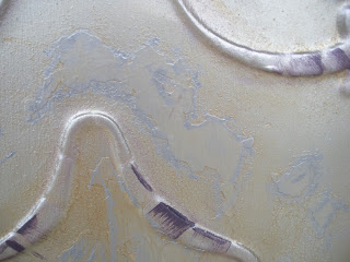
For this piece, there wasn't and exact method. Some painting with a rag, sponge brush, actual sponge, and my fingers. Some places I left the paint, and some places I wiped it. Some areas are streaky, others are dabbed on. I just kinda went with what I was feeling and I have to admit...it was pretty fun! Here's some close ups of certain sections.
Here it is in my client's house, but my camera (or ahem, the camera user???) just doesn't capture the quality of the colors.
Also, she had the painting that you see in the picture below placed on a high ledge in her kitchen. She wanted me to make a flower arrangement to pull out the colors in it, so here's what I came up with:


